
The Brief
How could the user experience in TikTok could be transformed in a more organic way, and without any restrictions?
UX Research
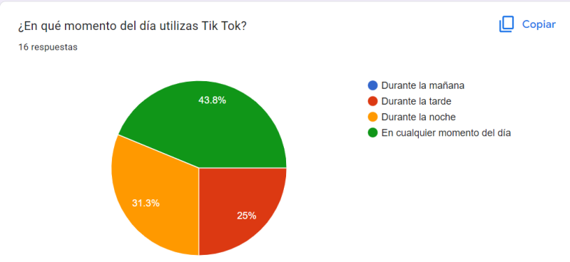
Based on the Design Thinking model, I put myself in the user’s shoes and analyzed the context in which TikTok is used. As a result of this research, I discovered that most users access the app at any time of the day and while performing other activities. The evidence can be seen in the survey results shown below:
Haz clic aquí para añadir texto

Value Proposition Canvas
Based on the data above, I decided it was necessary to create a Value Proposition Canvas, with the main goal of finding a balance between the business needs and those of the users. This VPC can be seen in the image below:

As a result of this technique, I discovered that TikTok needed a new feature allowing users to AutoSwipe to access more content in less time.
Style Guide & New Feature

To create the new button, I had to take the product’s style guide into account. This led me to the following solution:

Result:
Next Steps
-
Continuar desarrollando la iconografía del nuevo botón porque algunos de los entrevistados la encontraron confusa.
-
Realizar una nueva prueba A/B para encontrar una mejor ubicación para el nuevo botón.
Roles

UX Research

UX/UI
Haz clic aquí para añadir texto
Tools
Zoom

Google Meet
Crea tu propia página web con Webador